This DAX functions reference guide is for anyone who wants a fairly complete guide to the main DAX functions you are going to need to create business intelligence reports for businesses with Power BI.
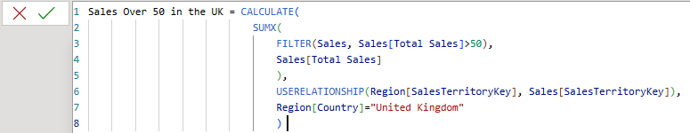
Table of Contents
Converting and Checking Data Types with DAX Functions
When writing DAX functions, such as with SQL, you will find that you sometimes need to cast (convert) data types, for example, from a text field to a numeric or from a date stored as text to a date data type.
VALUE()
Converts a text string that represents a number into a numeric value (decimal or whole number). Useful for converting text columns containing numeric values into actual numbers. Power BI sometimes performs this conversion implicitly, but VALUE ensures explicit conversion.
DATEVALUE()
Converts a text string representing a date into a date/time data type. (Commonly used to convert text dates into date values in DAX, though not explicitly listed in the search results, it is a standard DAX function.)
FORMAT(, )
Converts a value to text according to a specified format string. Useful for converting numbers or dates into formatted text strings.
TIMEVALUE() Converts a time in text format to a time data type
DATETIMEVALUE() Converts a text string to a datetime value.
Checking Data Types:
ISNUMBER() Returns TRUE if the value is a number.
ISTEXT() Returns TRUE if the value is text.
ISBLANK() Checks if a value is blank.
ISDATE() Returns TRUE if the value is a date.
ISFILTERED() / HASONEVALUE() – Useful for checking slicers/filters.
DAX Functions for Date, Date Arithmetic, and Time Intelligence
Nearly every Power BI business intelligence report you are likely to create (except projects like surveys, for example)
are going to include some form of time intelligence, often in the form of time series graphs. Monthly graphs are common examples, as are year-on-year, quarter on quarter-on-quarter. Working with time is an essential part of the
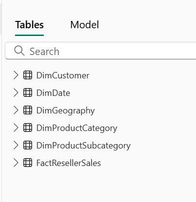
analyst or the business intelligence report developer. Learning to work with a central data table is also an essential part of the
process. Mastering these DAX functions is a core skill to have.
YEAR(date) Returns the year from a date.
MONTH(date) Returns the month number (1–12).
DAY(date) Returns the day of the month (1–31).
WEEKDAY(date, [return_type]) Returns the day of the week as a number (1–7).
HOUR(datetime) Returns the hour from a datetime.
MINUTE(datetime) Returns the minute.
SECOND(datetime) Returns the second.
QUARTER(date) Returns the quarter (1–4).
WEEKNUM(date, [return_type]) Returns the ISO or standard week number of the year.
TODAY() Returns the current date (no time).
NOW() Returns the current date and time.
DATE(year, month, day) Creates a date from numeric year, month, and day.
TIME(hour, minute, second) Creates a time from numeric components.
DATEVALUE(text) Converts a text string to a date.
TIMEVALUE(text) Converts a text string to a time.
DATETIMEVALUE(text) Converts a text string to a datetime
Date Arithmetic
EDATE(start_date, months) Adds/subtracts months to/from a date.
EOMONTH(start_date, months) Returns the end of the month after adding months.
DATEADD(dates, number_of_intervals, interval) Shifts dates forward/backward in time.
DATEDIFF(start_date, end_date, interval) Returns the difference between two dates in specified units.
ADDMONTHS(date, months) Alias for EDATE().
ADDDAYS(date, days) Use date + N instead.
Date Time Intelligence
TOTALYTD(expression, dates[, filter][, year_end_date]) Year-to-date total.
TOTALQTD(expression, dates[, filter]) Quarter-to-date total.
TOTALMTD(expression, dates[, filter]) Month-to-date total.
SAMEPERIODLASTYEAR(dates) Returns equivalent period from prior year.
PARALLELPERIOD(dates, number_of_intervals, interval) Returns a table shifted by intervals.
PREVIOUSYEAR(dates[, year_end_date]) Returns the previous year’s full set of dates.
PREVIOUSMONTH(dates) Returns the previous month.
PREVIOUSDAY(dates) Returns the previous day.
NEXTDAY(dates) Returns next day.
NEXTMONTH(dates) Returns next month.
NEXTYEAR(dates) Returns next year.
FIRSTDATE(dates) Returns the first date in a column.
LASTDATE(dates) Returns the last date in a column.
FIRSTNONBLANK(column, expression) Often used to get the first meaningful date.
LASTNONBLANK(column, expression) Same as above, but for last.
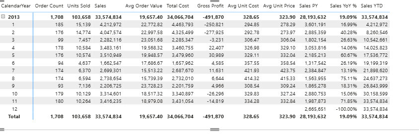
For calculating week-to-date, you can check out the post on calculating week-to-date sales here
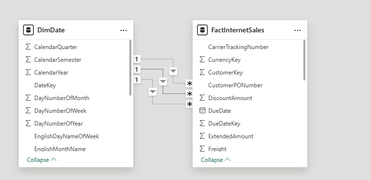
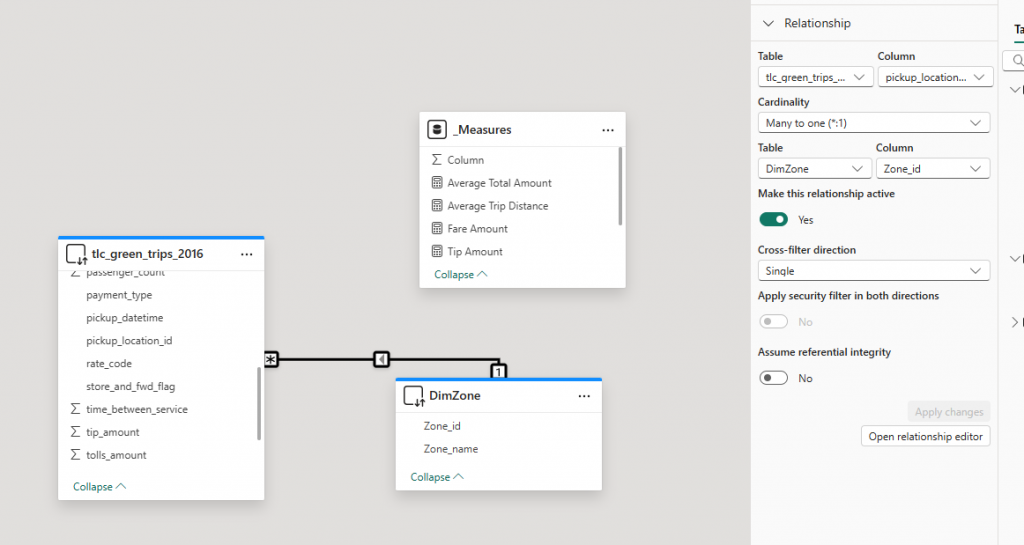
DAX Functions for Changing Table Relationships in Power BI
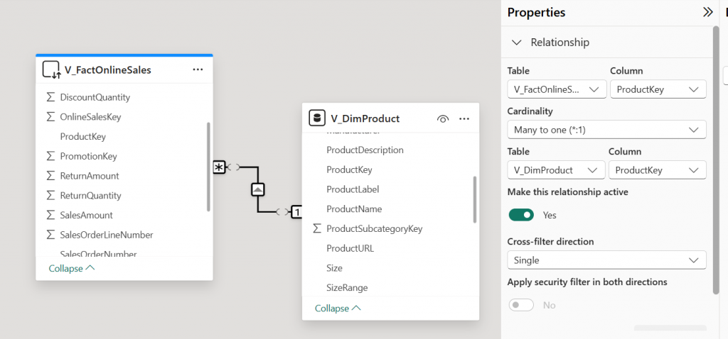
Knowing how to change table relationships in a Power BI model is a key skill for managing your data model.
Relationships in a Power BI model are like having permanent joins in a data warehouse. You don’t have to create the join each time to use it.
With DAX functions, you can change the relationship being used when calculating a measure, a bit like creating
joins in SQL, but where you have existing relationships, you also need to know how to break them, to prevent them from influencing your measure. Relationships that you create in a Power BI model are like fixed joins that are always there in
With TREATAS(), you can create new relationships. With USERELATIONSHIP(), you can activate existing inactive relationships, and with CROSSFILTER(), you can break relationships. These powerful DAX functions will enable you to work around your model without creating a spaghetti junction model.
Sales by Ship Date :=
CALCULATE(
SUM(Sales[Amount]),
USERELATIONSHIP(Sales[ShipDate], Calendar[Date])
)
CROSSFILTER()
Changes the direction or disables a relationship during calculation.
Sales Cross Filter Both :=
CALCULATE(
SUM(Sales[Amount]),
CROSSFILTER(Customers[CustomerID], Sales[CustomerID], BOTH)
)
Modes:
BOTH — Bidirectional filter
ONEWAY — Single direction (default)
NONE — Disable the relationship for the calculation
REMOVEFILTERS() / ALL()
Not relationship changers per se, but they can negate filtering effects, which affects how joins behave in a visual context.
Total Sales (Ignore Customer Filter) :=
CALCULATE(
SUM(Sales[Amount]),
REMOVEFILTERS(Customers)
)
TREATAS()
Applies values from one column as if they came from another — acts like a custom join.
Sales for Selected Regions :=
CALCULATE(
SUM(Sales[Amount]),
TREATAS({“East”, “West”}, Regions[RegionName])
)
LOOKUPVALUE() / RELATED() / RELATEDTABLE()
These retrieve values across relationships — they don’t modify relationships but emulate joins in calculated columns or measures
Customer Region := RELATED(Customers[Region])
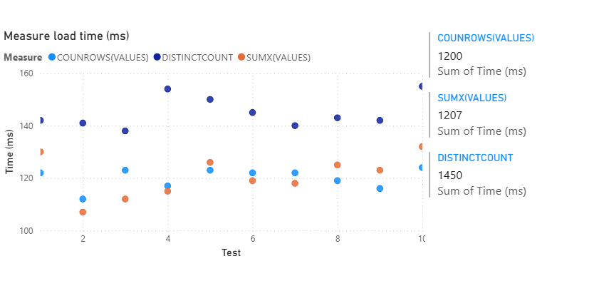
Aggregated DAX Functions and Table DAX Aggregated Functions.
These are the functions that do the math in your DAX measures. They summarize, group, or compute totals over columns or expressions. When referencing columns in related tables, you can use the X functions. X functions are also useful when you are referencing parts of a virtual table created in a DAX function, such as by using the SUMMARIZE() or SELECTCOLUMNS() functions.
SUM(<column>) | Adds up all the values in a column. |
AVERAGE(<column>) | Returns the mean (arithmetic average). |
MIN(<column>) | Returns the smallest value. |
MAX(<column>) | Returns the largest value. |
COUNT(<column>) | Counts non-blank values in a column. |
COUNTA(<column>) | Counts non-empty values (text, numbers, etc.). |
COUNTBLANK(<column>) | Counts the number of blank values. |
COUNTROWS(<table>) | Returns the number of rows in a table. |
DISTINCTCOUNT(<column>) | Returns the count of unique values. |
PRODUCT(<column>) | Multiplies all values in a column. |
MEDIAN(<column>) | Returns the median (middle value). |
STDEV.P(<column>) | Standard deviation (population). |
STDEV.S(<column>) | Standard deviation (sample). |
VAR.P(<column>) | Variance (population). |
VAR.S(<column>) | Variance (sample). |
Table Aggregation Functions
| Function | Description |
|---|---|
SUMX(<table>, <expression>) | Sums up values calculated row by row over a table. |
AVERAGEX(<table>, <expression>) | Returns the average of an expression over a table. |
MINX(<table>, <expression>) | Minimum value evaluated row by row. |
MAXX(<table>, <expression>) | Maximum value row by row. |
COUNTX(<table>, <expression>) | Count of non-blank results from row-wise evaluation. |
MEDIANX(<table>, <expression>) | Median value from a row-wise calculation. |
STDEVX.P(<table>, <expression>) | Standard deviation across rows (population). |
STDEVX.S(<table>, <expression>) | Standard deviation (sample). |
VARX.P(<table>, <expression>) | Variance (population). |
VARX.S(<table>, <expression>) | Variance (sample). |
Arithmetic and Logical DAX functions
Arithmetic functions provide the standard set of mathematical functions you would expect in any programming environment. The DIVIDE() function is useful to prevent errors from showing in your reports.
Arithmetic DAX Functions
DIVIDE(<numerator>, <denominator>[, <alternateResult>]) | Performs safe division, avoiding division-by-zero errors. |
+ | Adds two numbers. |
- | Subtracts one number from another. |
* | Multiplies two numbers. |
/ | Divides two numbers (can cause errors if denominator is zero). |
^ | Raises a number to the power of another (exponentiation). |
MOD(<number>, <divisor>) | Returns the remainder after division. |
QUOTIENT(<numerator>, <denominator>) | Returns the integer portion of a division. |
Logical Functions
Logical DAX functions are simple functions that help you do a bit more in DAX. IF() allows for some simple IF ELSE logic, while SWITCH() allows you to write IF() statements in a more structured way. There is also some error handling and functions to help with conditional logic.
IF() | Basic conditional logic. |
SWITCH() | Multi-condition replacement for nested IFs. |
IFERROR() | Returns alternate result if there’s an error. |
AND(), OR() | Combine logical tests. |
NOT() | Negates a logical expression. |
DAX Functions using Calculate()
The CALCULATE() DAX function enables you to filter your measures in many different ways. It is often said to be the most important measure to master in DAX, as it enables you to jump from the simple Excel-like arithmetic functions to a more powerful mastery of DAX, which takes it to a higher level than Excel formulas. It is useful to compare measures that are created with FILTER() against the CALCULATE() function to see the differences between them.
DAX CALCULATE() changes the filter context and then evaluates then.
Simple Filter
Sales for US :=
CALCULATE(
SUM(Sales[Amount]),
Customers[Country] = “United States”
)
Time Intelligence
Sales Last Year :=
CALCULATE(
SUM(Sales[Amount]),
SAMEPERIODLASTYEAR(‘Date'[Date])
)
YTD Sales :=
CALCULATE(
SUM(Sales[Amount]),
DATESYTD(‘Date'[Date])
)
Multiple Filters
High Value EU Sales :=
CALCULATE(
SUM(Sales[Amount]),
Sales[Amount] > 1000,
Customers[Region] = “EU”
)
Using USERELATIONSHIP
Sales by Ship Date :=
CALCULATE(
SUM(Sales[Amount]),
USERELATIONSHIP(Sales[ShipDate], ‘Date'[Date])
)
Using CROSSFILTER
Sales with Bi-directional Filter :=
CALCULATE(
SUM(Sales[Amount]),
CROSSFILTER(Products[ProductID], Sales[ProductID], BOTH)
)
Removing Filters
All Sales (Ignore Product Filter) :=
CALCULATE(
SUM(Sales[Amount]),
REMOVEFILTERS(Products)
)
Sales All Time :=
CALCULATE(
SUM(Sales[Amount]),
ALL(‘Date’)
)
Filtering by Measure
Sales Above Average :=
CALCULATE(
SUM(Sales[Amount]),
Sales[Amount] > AVERAGE(Sales[Amount])
)
Conditional Filters (TREATAS)
Sales for Selected Categories :=
CALCULATE(
SUM(Sales[Amount]),
TREATAS({“Furniture”, “Office Supplies”}, Products[Category])
)
Filtering by Related Table
Sales to Gold Customers :=
CALCULATE(
SUM(Sales[Amount]),
Customers[CustomerType] = “Gold”
)
— 🧠 Dynamic Filtering with Measures
Sales Last N Days :=
CALCULATE(
SUM(Sales[Amount]),
DATESINPERIOD(‘Date'[Date], MAX(‘Date'[Date]), -30, DAY)
)
DAX Functions using CALCULATETABLE()
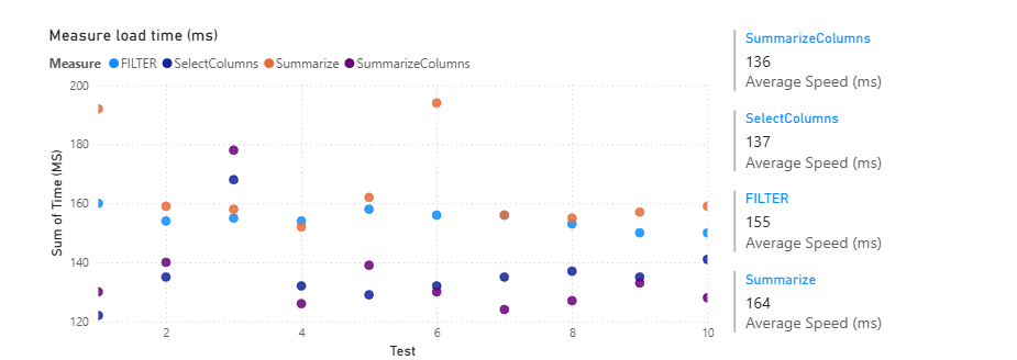
Calculate is similar to CALCULATE() in that it is a filter function, but it is a table filter function, so it is very powerful and can be used for filtering tables created in functions such as SUMMARIZE() and SELECTCOLUMNS ().
You can use it in DAX variables to filter virtual tables, which is a very powerful technique.
Basic Filtered Table with CALCULATETABLE()
EU Sales Table :=
CALCULATETABLE(
Sales,
Customers[Region] = “EU”
)
Time Intelligence Table with CACLULATETABLE()
Sales Last Year Table :=
CALCULATETABLE(
Sales,
SAMEPERIODLASTYEAR(‘Date'[Date])
)
Multiple Filters
High Value US Sales Table :=
CALCULATETABLE(
Sales,
Customers[Country] = “United States”,
Sales[Amount] > 1000
)
The FILTER() DAX Function
The FILTER() function is used to change the filter on a table and can be used inside a CALCULATE function.
It can be used for certain jobs that CALCULATE can’t do, for example:
CALCULATE( [Total Sales], [Total Sales] > 1000 ) — invalid
CALCULATE([Total Sales],FILTER(ALL(Sales),[Total Sales] > 1000) — Valie)
Basic FILTER inside CALCULATE
Sales Over 1000 :=
CALCULATE(
SUM(Sales[Amount]),
FILTER(Sales, Sales[Amount] > 1000)
)
Multiple Conditions
High Sales in EU :=
CALCULATE(
SUM(Sales[Amount]),
FILTER(
Sales,
Sales[Amount] > 1000 && Sales[Region] = “EU”
)
)
Time-based Filtering
Last 30 Days Sales :=
CALCULATE(
SUM(Sales[Amount]),
FILTER(
‘Date’,
‘Date'[Date] >= TODAY() – 30 && ‘Date'[Date] <= TODAY()
)
)
FILTER with RELATED
Gold Customer Sales :=
CALCULATE(
SUM(Sales[Amount]),
FILTER(
Sales,
RELATED(Customers[CustomerType]) = “Gold”
)
)
Nested FILTER with VALUES
Top 5 Customers by Sales :=
TOPN(
5,
FILTER(
VALUES(Customers[CustomerID]),
CALCULATE(SUM(Sales[Amount])) > 0
),
CALCULATE(SUM(Sales[Amount]))
)
FILTER used in a variable
Sales Filtered by Variable :=
VAR FilteredTable = FILTER(Sales, Sales[Amount] > 1000)
RETURN
SUMX(FilteredTable, Sales[Amount])
DAX REMOVFILTERS() Function
REMOVEFILTERS(), as the name suggests, is used to remove filters on a measure. It is usually used inside CALCULATE()
and enables more advanced filter changes. You can use it on an entire table or a specific column.
Remove all filters from a table
Total Sales (Ignore All Product Filters) :=
CALCULATE(
SUM(Sales[Amount]),
REMOVEFILTERS(Products)
)
Remove filters from one column only
Total Sales (Ignore Product Category Only) :=
CALCULATE(
SUM(Sales[Amount]),
REMOVEFILTERS(Products[Category])
)
Remove filters but keep others
Total Sales (Ignore Region but Keep Country) :=
CALCULATE(
SUM(Sales[Amount]),
REMOVEFILTERS(Customers[Region])
)
Remove all date filters (for lifetime total)
Total Sales All Time :=
CALCULATE(
SUM(Sales[Amount]),
REMOVEFILTERS(‘Date’)
)
Compare Filtered vs Unfiltered
Sales vs All Time :=
DIVIDE(
SUM(Sales[Amount]),
CALCULATE(
SUM(Sales[Amount]),
REMOVEFILTERS(‘Date’)
)
)
Remove filters in a variable
Sales With No Customer Filters :=
VAR AllSales = CALCULATE(
SUM(Sales[Amount]),
REMOVEFILTERS(Customers)
)
RETURN
AllSales
DAX Table Functions
DAX table functions are powerful functions to manipulate tables inside measures.
VALUES() | Returns a one-column table of distinct values. |
ALL() | Removes filters and returns all values. |
ALLSELECTED() | Returns values considering applied visual filters. |
SELECTCOLUMNS() | Creates a new table with selected columns. |
ADDCOLUMNS() | Adds a calculated column to a table. |
SUMMARIZE() | Groups and aggregates a table. |
UNION(), INTERSECT(), EXCEPT() | Set operations on tables. |
CROSSJOIN() | Cartesian join between two tables. |
Ranking and Windowing
RELATED() Pulls a value from a related table (many-to-one).
RELATEDTABLE() Returns a table from a related one-to-many relationship.
LOOKUPVALUE() Returns a value by matching one or more columns (like VLOOKUP).
Statistical Functions
MEDIAN() / MEDIANX() Median value.
STDEV.P() / STDEV.S() Standard deviation.
VAR.P() / VAR.S() Variance.
GEOMEAN() / GEOMEANX() Geometric mean.
More Iteration Functions
MAXX(), MINX() Row-by-row max/min across a table.
COUNTX() Row-by-row counting.
RANKX() Ranks evaluated row-by-row.
CONCATENATEX() Joins text values across rows with a delimiter.
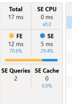
Once you’ve got the DAX functions under your belt, check out the post on creating multiple measures at once
DAX Code Examples
Here are some more DAX code examples.
1. Using Variables
2. FORMAT()
3. HASONEVALUE()
4. AND, &&
5. CALCULATETABLE() and SUMMARIZE()
6. USERELATIONSHIP()
7. SWITCH()
8. ISFILTERED() and making visual transparent
9. SELECTEDVALUE() and creating a dynamic Graph Title
10. FILTER and ADDCOLUMNS
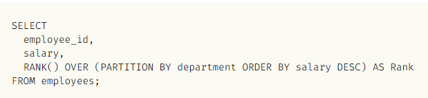
11. RANK()
VAR: Using Variables
Running Total =
VAR MaxDateInFilterContext = MAX ( Dates[Date] ) //variable 1 max date#
VAR MaxYear = YEAR ( MaxDateInFilterContext ) //variable 2 year of max date
VAR DatesLessThanMaxDate = //variable 3 filter dates > variable 1 and variable 2
FILTER (
ALL ( Dates[Date], Dates[Calendar Year Number] ),
Dates[Date] <= MaxDateInFilterContext
&& Dates[Calendar Year Number] = MaxYear
)
VAR Result = //variable 4 total sales filtered by variable 3
CALCULATE (
[Total Sales],
DatesLessThanMaxDate
)
RETURN
Result //return variable 4
FORMAT: Formatting Numbers
actual = if(sum[actual] >1000000, “FORMAT(SUM([actual], “#, ##M”), IF(SUM([actual]>=1000, “FORMAT(SUM(actual]), “#,,.0K”))
FORMAT(min(column, “0.0%”)
FORMAT(min(column, “Percent”)
eg, if the matrix is filtered,
IF(ISFILTERED(field], SELECTEDVALUE([column])
HASONEVALUE: Check if the column has one value in if
Valuecheck = if(HASONEVALUE([column], VALUES(field))
FILTER table by related field = united states and sumx salesamount_usd
= SUMX(FILTER( ‘InternetSales_USD’ , RELATED(‘SalesTerritory'[SalesTerritoryCountry]) <>”United States” ) ,’InternetSales_USD'[SalesAmount_USD])
AND, can also use &&
Demand =
SUMX (
FILTER (
RELATEDTABLE ( Assignments ),
AND (
[AssignmentStartDate] <= [TimeByDay],
[TimeByDay] <= [AssignmentFinishDate]
)
),
Assignments[Av Per Day]
)
CALCULATETABLE, SUMMARIZE
Calculate Table with Summarize and Filter
Order Profile =
CALCULATETABLE (
SUMMARIZE (
‘Sales Table’,
‘Sales Table'[Order_Num_Key],
Customer[Sector],
“Total Value”, SUM ( ‘Sales Table'[Net Invoice Value] ),
“Order Count”, DISTINCTCOUNT ( ‘Sales Table'[Order_Num_Key] )
),
YEAR ( DimDate[Datekey] ) = YEAR ( TODAY () )
)
)

USERELATIONSHIP Uses inactive relationship between tables

CALCULATE (
    [Sales Amount],
    Customer[Gender] = "Male",
    Products[Color] IN { "Green", "Yellow", "White" },
    USERELATIONSHIP ( Dates[Date], Sales[Due Date] ),
    FILTER ( ALL ( Dates ), Dates[Date] < MAX ( Dates[Date] ) )
SWITCH
SWITCH(<expression>, <value>, <result>[, <value>, <result>]…[, <else>])
= SWITCH([Month], 1, “January”, 2, “February”, 3, “March”, 4, “April” , 5, “May”, 6, “June”, 7, “July”, 8, “August” , 9, “September”, 10, “October”, 11, “November”, 12, “December” , BLANK() ) //place on separate lines
SWITCH with Measure
= SWITCH(TRUE(),
[measure] = “turnover”, [turnover]
[measure] = “Profit”, “[Profit]
, BLANK()
)
Visuals
ISFILTERED()
Check Filtered = ISFILTERED([column])
For a complete DAX guide, visit SQLBI at https://dax.guide/