Git version control keeps track of every change to DAX measures, model relationships, table metadata, M code, and report visuals (if any). It allows you to go back to older versions and compare versions, and see exactly what has been changed.
If 2 people work on the same PBIX file, changes can be overwritten, making collaboration difficult. With Git, each person works on their own branch, and Git merges the changes, so you can review and approve changes.
You need to convert your PBIX file to a PBIP file for Power BI Git integration. The PBIP file points to a folder holding all your Power BI datasets and report elements in text-readable files(except the data itself), but when you work with PBIP, you can see data (confusing) as Power BI Desktop stores it in a hidden temp file separate from the PBIP folder, so you can still add tables, etc, with PBIP.
There are 2 options:
1. GitHub
2. Azure DevOps
Both use the same underlying Git technology, which is the open source version control system originally created by Linus Torvald. Microsoft bought GitHub for $7.5 billion dollars in 2018. So Microsoft actually owns both.
Power BI Git Integration – GitHub vs. Azure DevOps
A comparison summary of GitHub vs. Azure DevOps is below. Privacy and security are the main differences.
| Feature | Azure DevOps | GitHub |
| Home | Microsoft Entra ID tenant | Github.com |
| Privacy | Higher – stays in corporate tenant, controlled by your policies | Lower – repos live in GitHub cloud, identity separate unless using SSO |
| Best for | Enterprise, regulated data, security | Open-source, general dev, small teams. |
| Access control | Uses Entra ID roles, security groups, conditional access, MFA | Github roles + optional Github |
| Data | Repos stored inside Azure DevOps under your tenant | Repos stores in GitHub’s cloud. |
| Cost | Free for individuals, companies pay. | Free for individuals, companies pay. |
Power BI File Types
There are several different Power BI file types, which are useful to understand before diving into Git Integration.
| File Type | Includes | Features |
| PBIX file – compresses the PBIP + cached data | Everything in one file – Report visuals – Data model (semantic model) – Power Query M code – cached data (imported tables). | Binary – not Git friendly. You cannot track changes. |
| PBIP – Power BI Project (Folder based format) | Folder including: – model.bim (semantic model) – DataModelSchema.json (Power Query / M) – *.pbir (report JSON) – Project.json | These are Git friendly (all txt files) PBIP – Power BI Project (Folder-based format) You can merge changes. Designed for DevOps Tabular editor can edit a BIM file. |
| BIM – Tabular Model file (model.BIM) | A JSON file that can be created by PBI desktop, Tabular editor, or Analysis Services tabular. | Does not contain Power Query M, Data or report pages. You can version control the semantic model only. |
| TMDL – Tabular Modular Definition (newer than BIM) | Created by TE3 and Fabric Semantic Models. Contains the same info as BIM but in separate files: – e.g. Sales.json – Data.json – Amount.json – Total sales.json | Better for version control, but not fully supported and more complex. |
| TMSL – Tabular Model Scripting Language | JSON format used in XMLA deployments | |
| JSON Power BI Report (.PBIR) | Part of PBIP – Contains only the report layout, no model or data. |
Git version control
For solo development, you can just use Git locally, but you need to switch between PBIX and PBIP files that can be synced with the Git Repo.
For multi-developer safety and automation, enable workspace Git integration:
When you use Git integration with Power BI, it automatically converts the file into a PBIP format in your Git repo.
– Set up workspace with Git Integration
– Connect the workspace to a Gi Repo
– Choose the direction of the sync (Workspace > Git)
Note: Syncing with Git is manual
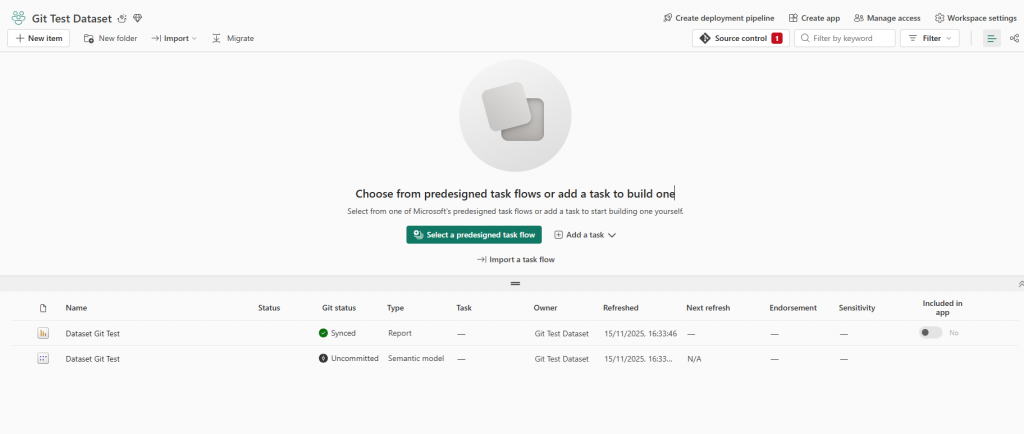
When you upload to the PBI service, the service will show “Uncommitted changes”.
Then you have to manually synchronize changes with GitHub
So let’s try it.
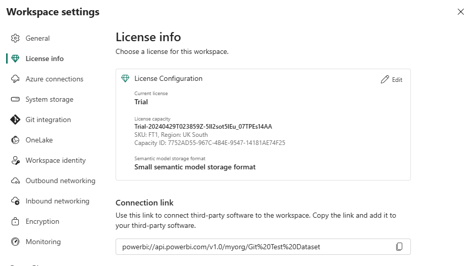
Luckily, I still have my Fabric free trial on my Power BI account running. It’s on FT1.
To get started, I will setup the following first:
- Create a new workspace called: Gi Test Dataset
- I create a test dataset and load my Adventure Works tables into it.
- Publish my dataset to my GI Test Dataset workspace.
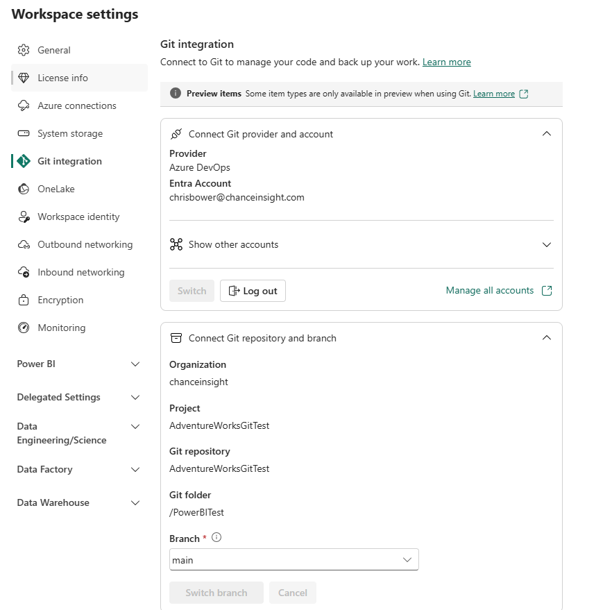
- I go to my workspace settings and select Git Integration.
I note that i only have the option for Azure DevOps and not GitHub.
Power BI GitHub integration can be enabled in the Tenant Admin Control settings.
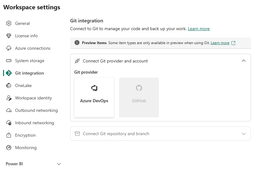
So I will try with Azure DevOps first:
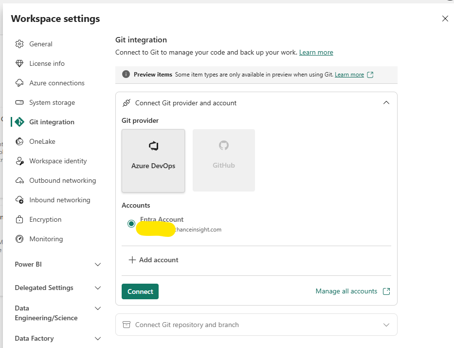
I select Connect and i’m given some details to fill in:
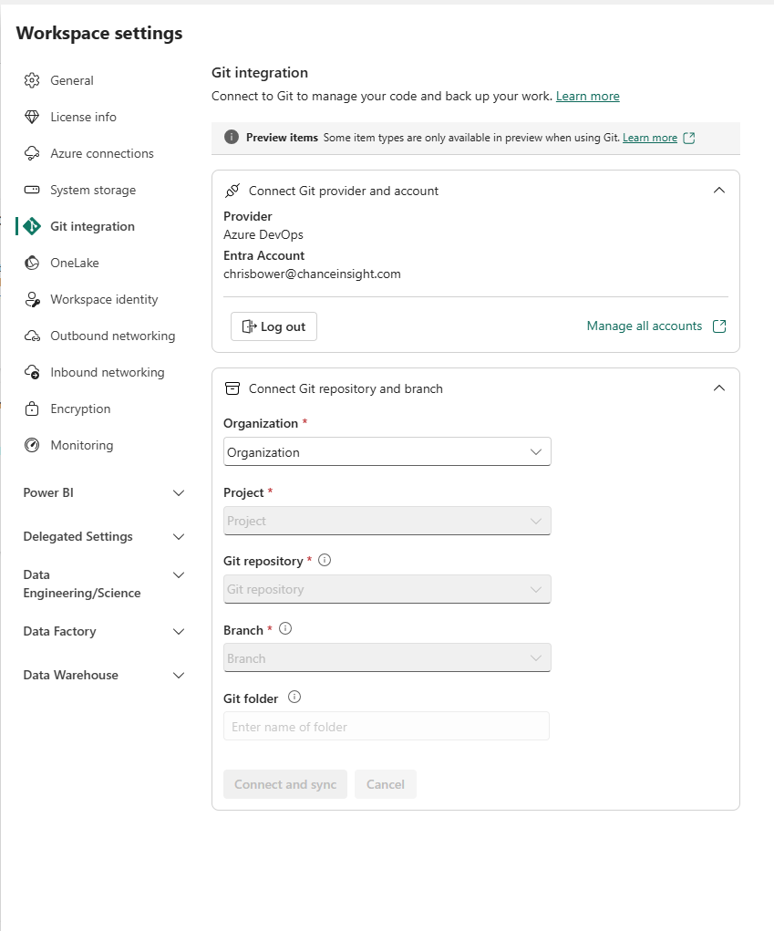
To use Azure DevOps for Power BI git integration, you ned to use an Azure account, which you can get for free to start, if you want to try it.
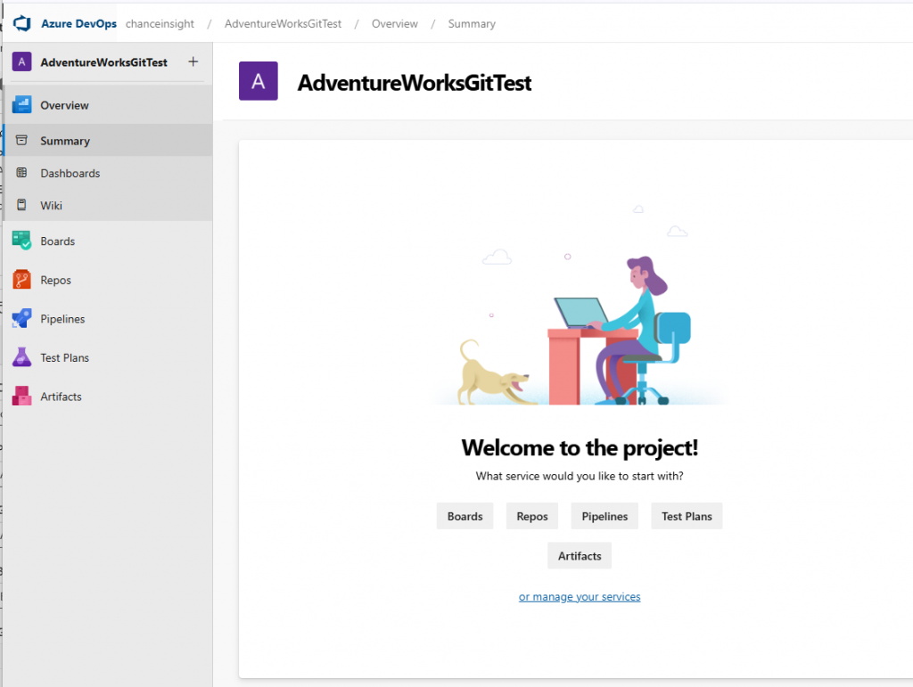
Once you get to DevOps, you start by setting up your company name and project
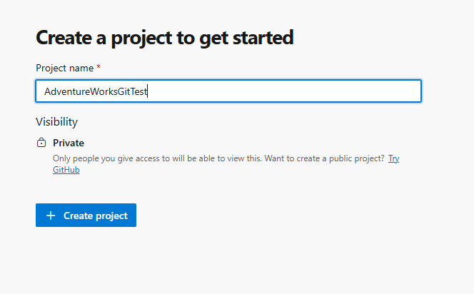
My project URL is now as follows, where companyname is the organisation name I chose.
https:/dev.azure.com/companyname/adventureworksgittest
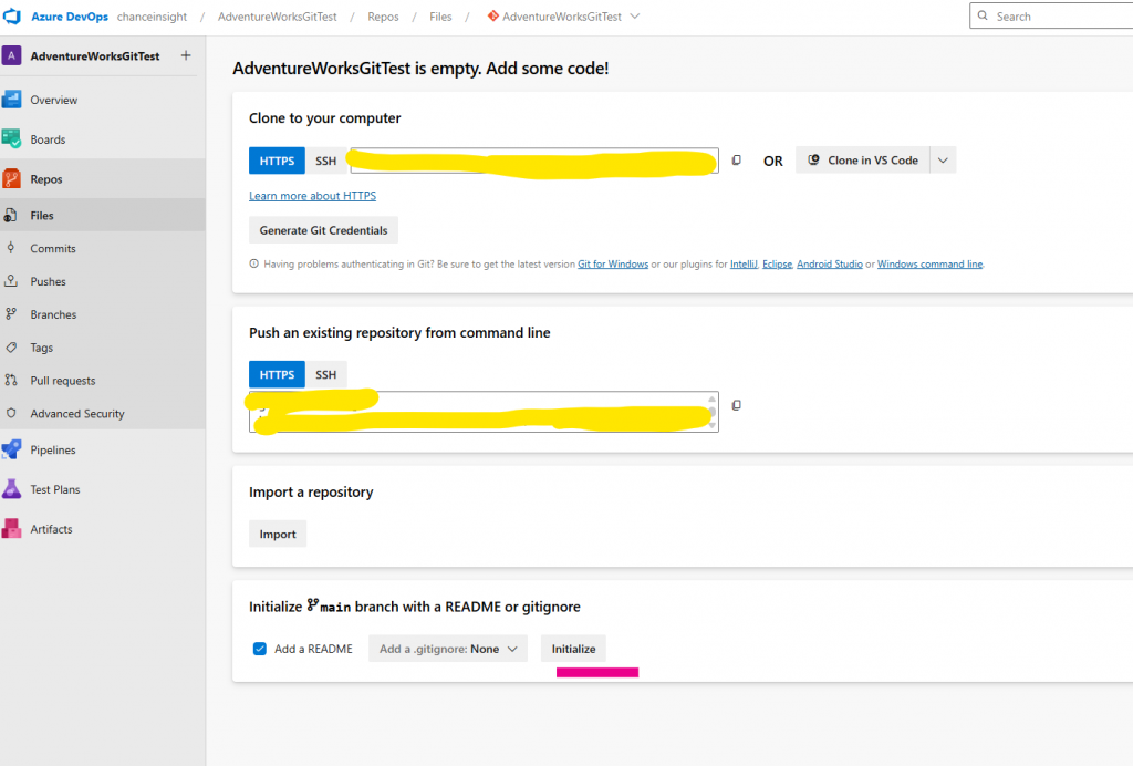
Next, we select Repos, and then we just need to click Initialise to set up the main branch, and it should be ready.
Now I seem to have everything I need. It just asks for a Git folder name, which I enter last.
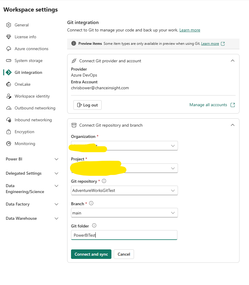
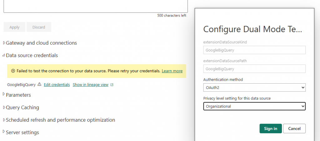
I hit connect, and i get an error:
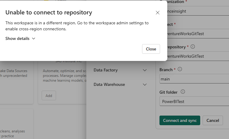
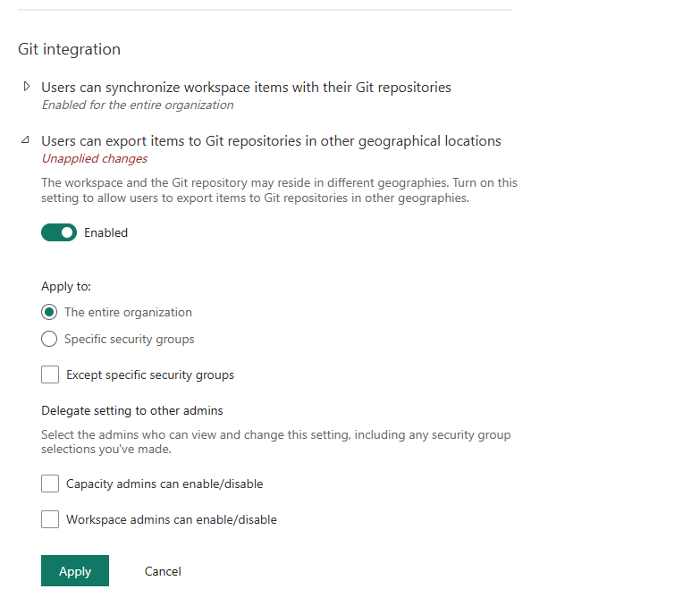
So I go back to the Admin portal and enable the other geographical locations option.
That cleared the error, and when I retry my git connection, I get this message:
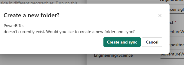
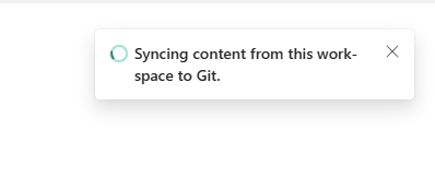
And it seems to be working.
Returning to Azure, I can see my Power BI Test folder, which is my PBIP folder, and 2 sub-folders.
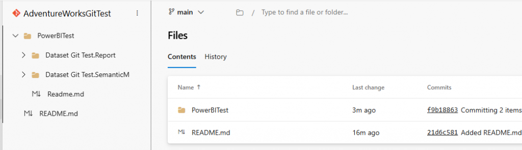
The first folder has report-related files, the second has dataset-related files, all in tmdl format
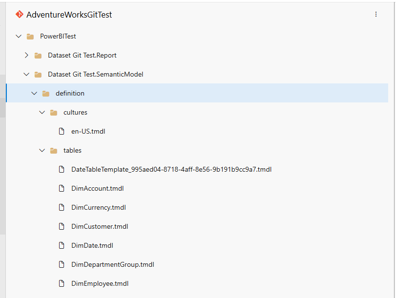
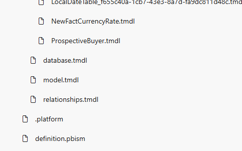
Then we have the model tmdl files:
Files included in the folder on Git are as follows:
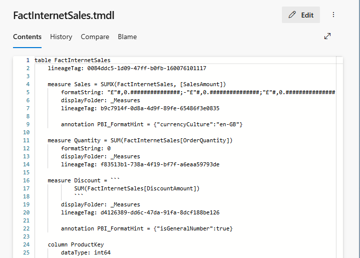
- The table files contain:
Columns, Measures, Hierarchies, Datatypes, and DAX Measure Definitions - The relationships.tmdl file contains all table relationships.
- The model.tmdl contains calculation groups, Global metadata, and Time Intelligence
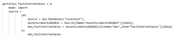
- database.tmdl contains: Data sources, Connection strings, partitions, and refresh policies.
- /Cultures/en-US.tmdl contains translations, format strings, etc.
- definition.pbism is the entry point file for the semantic model.
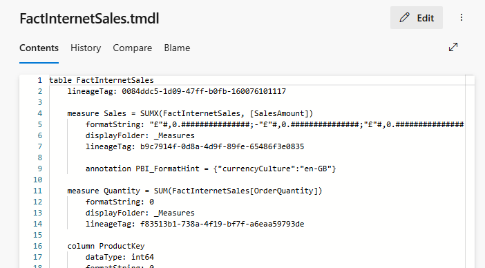
Clicking on a table, we can see the TMDL for the table. That is pretty nice. You can even edit the model in DevOps and commit the changes back (but don’t break the model).
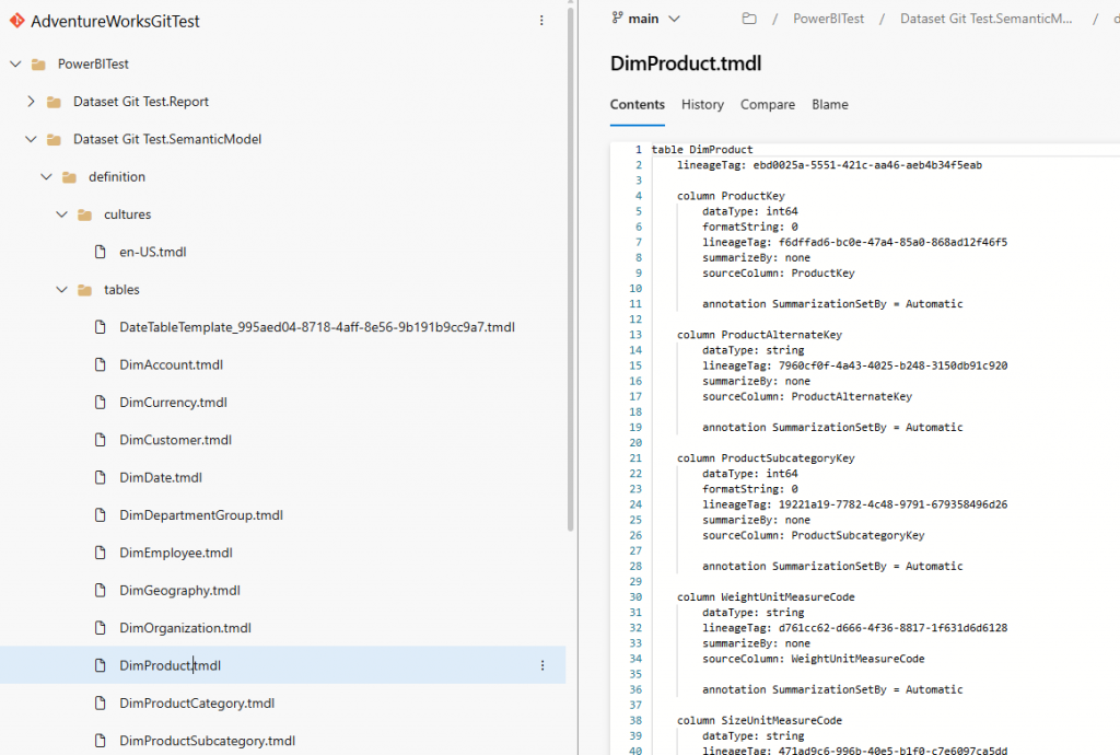
If I scroll down, I can also see the m code. That’s pretty useful.
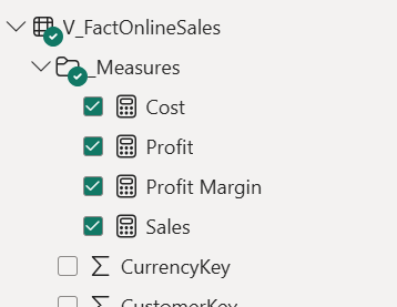
Next, I’m going to add a measure to my dataset and republish.
I go back to Azure DevOps and check my table, but I can’t see my measure.
Because I used the PBIX file, it overwrote the dataset, and so all changes disappeared. Hmmmm.
So I need to change my PBIX file to a PBIP folder
When I publish it still overwrites the dataset.
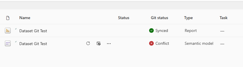
When I check my files in the workspace, I have a conflict on the dataset.
This is because I started with a PBIX and switched to PBIP
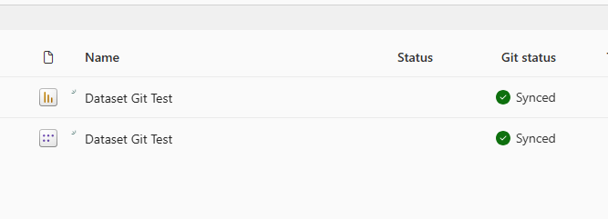
So I went to my Git Repo and deleted my PowerBITest folder, then in Power BI workspace settings > Github integration and disconnected.
Now reconnect my Power BI git Integration as before, and I have green lights (and my folder is back in my Git Repo).
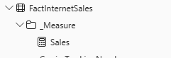
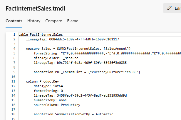
I can now see my measure in my FactInternetSales.tmdl file.
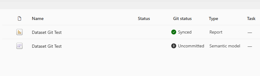
Now I create another measure – but now I’m working in my PBIP (Power BI Project) File.
This time it says ‘Uncommitted’. Good.
Next, I got back to Git Integration in workspace settings, disconnected, and then reconnected with exactly the same details as before. Now I get this:
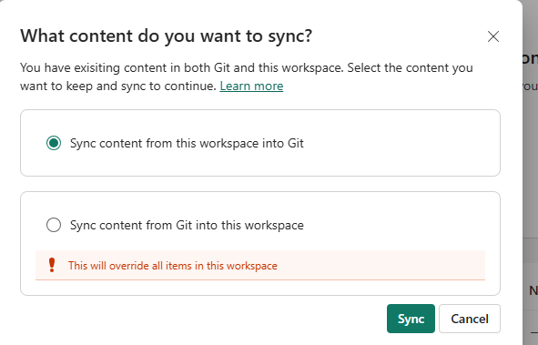
After syncing my content from the workspace to Git, I now have the green lights again.
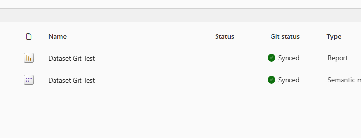
And when I check the TMDL, I can see my new measure (quantity):
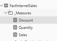
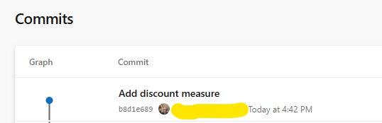
Now it’s working, I am going to add a 3rd measure: ‘Discount.’
I check my workspace again and see it is not synced, but I still don’t have a sync option in the Power BI Git Integration settings:
And now have a source control button!
I select the source control button, and now I can commit my changes and some details:
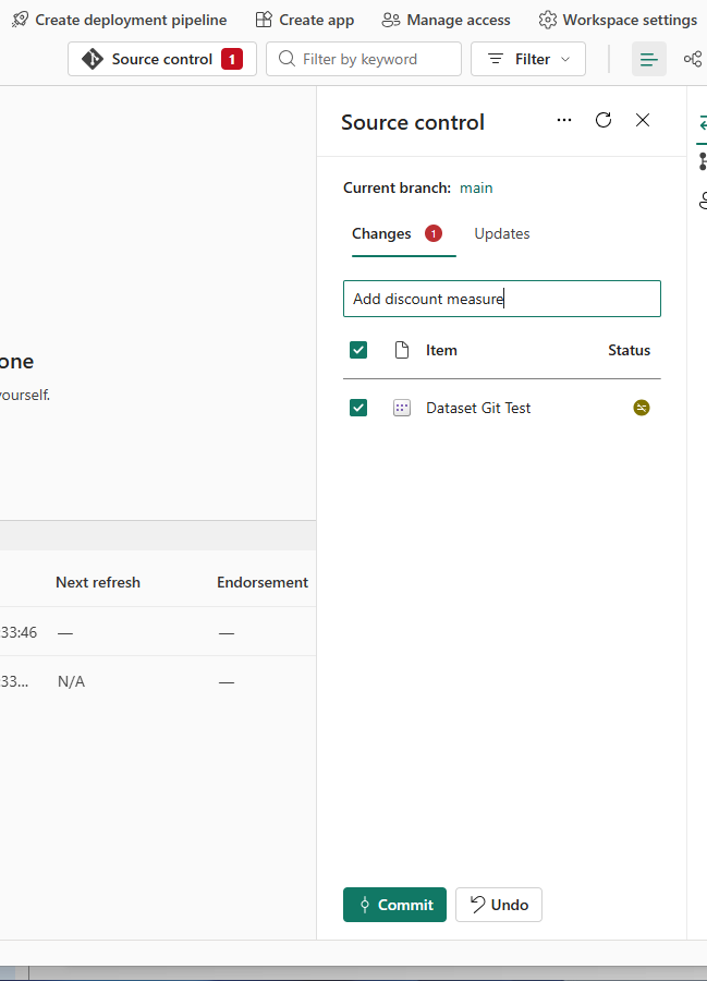
And it worked. Great! My 3rd measure is showing.
I can also see a record of my commits with the notes I entered.
Well, that went pretty smoothly. The next steps will be to test my Power BI git integration further and restore the dataset to an earlier version to see how that works.
View Microsoft Power BI git integration documentation for further information